Exhibition Design

Nimany Exhibition

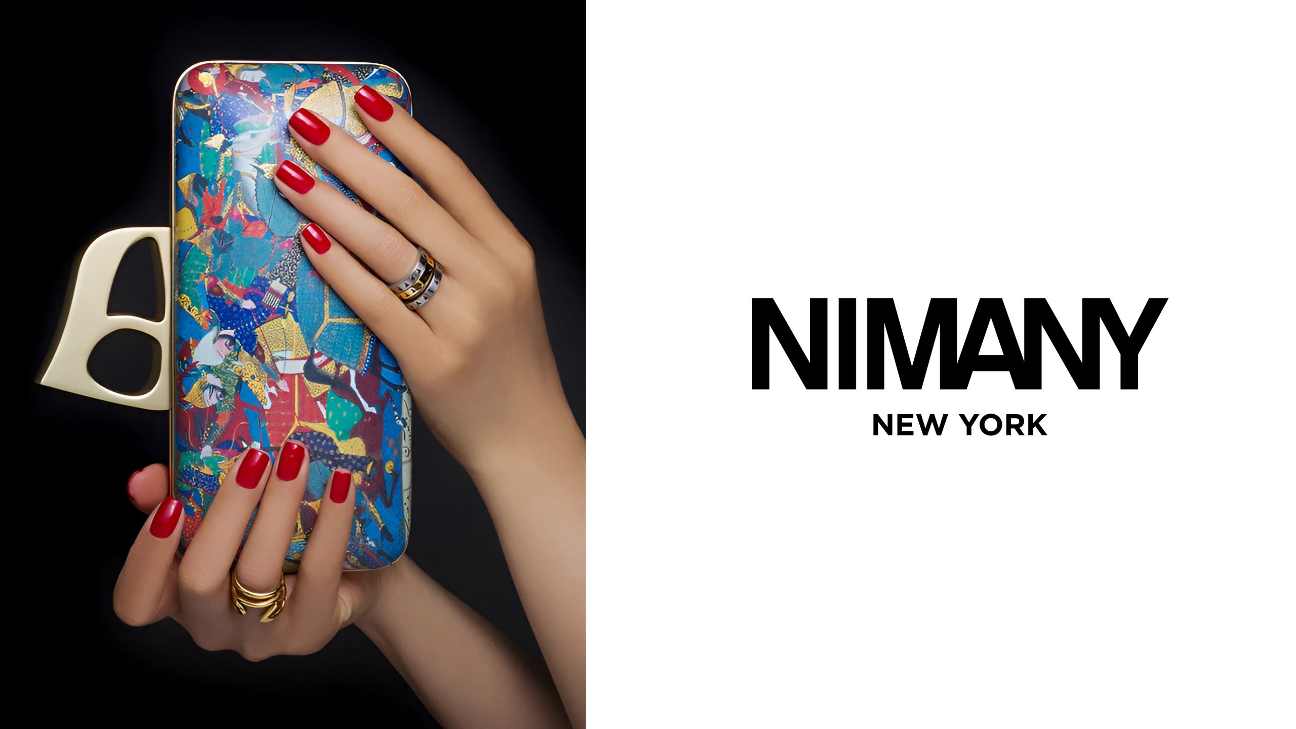
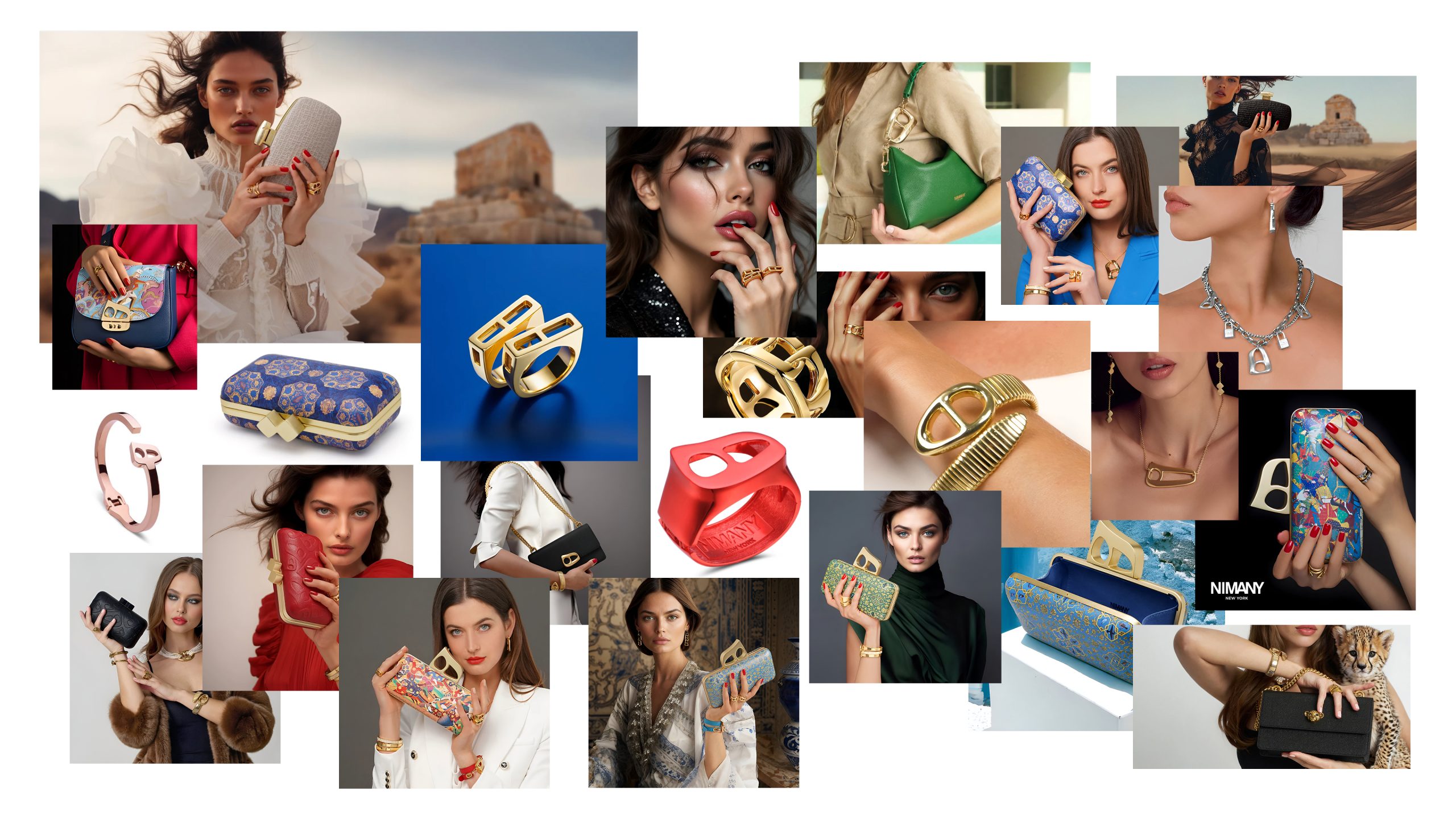
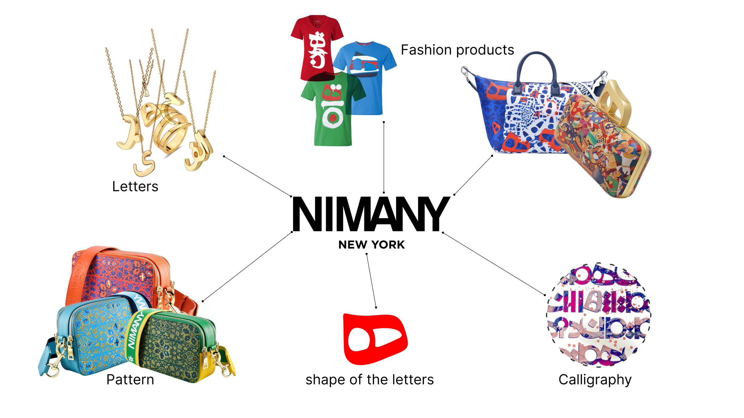
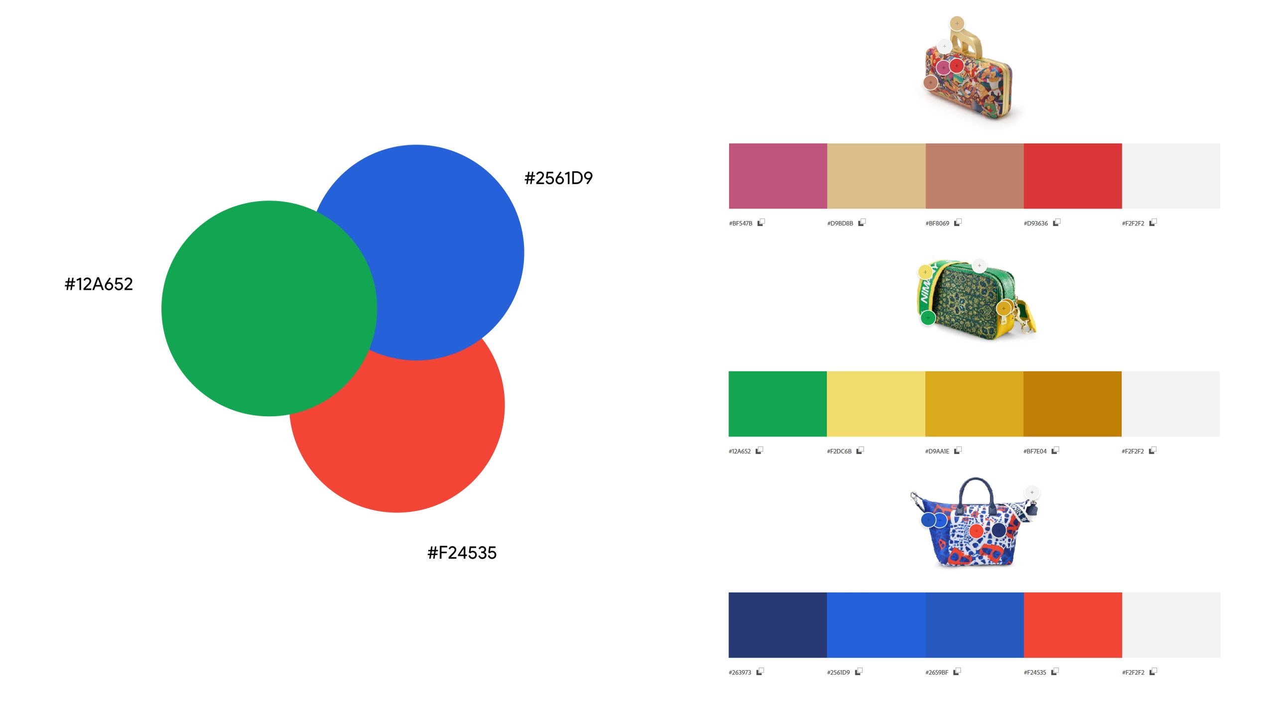
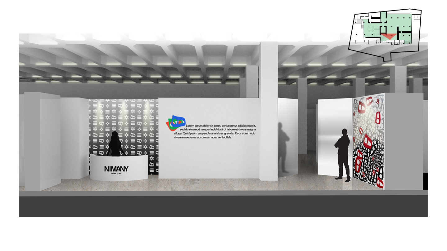
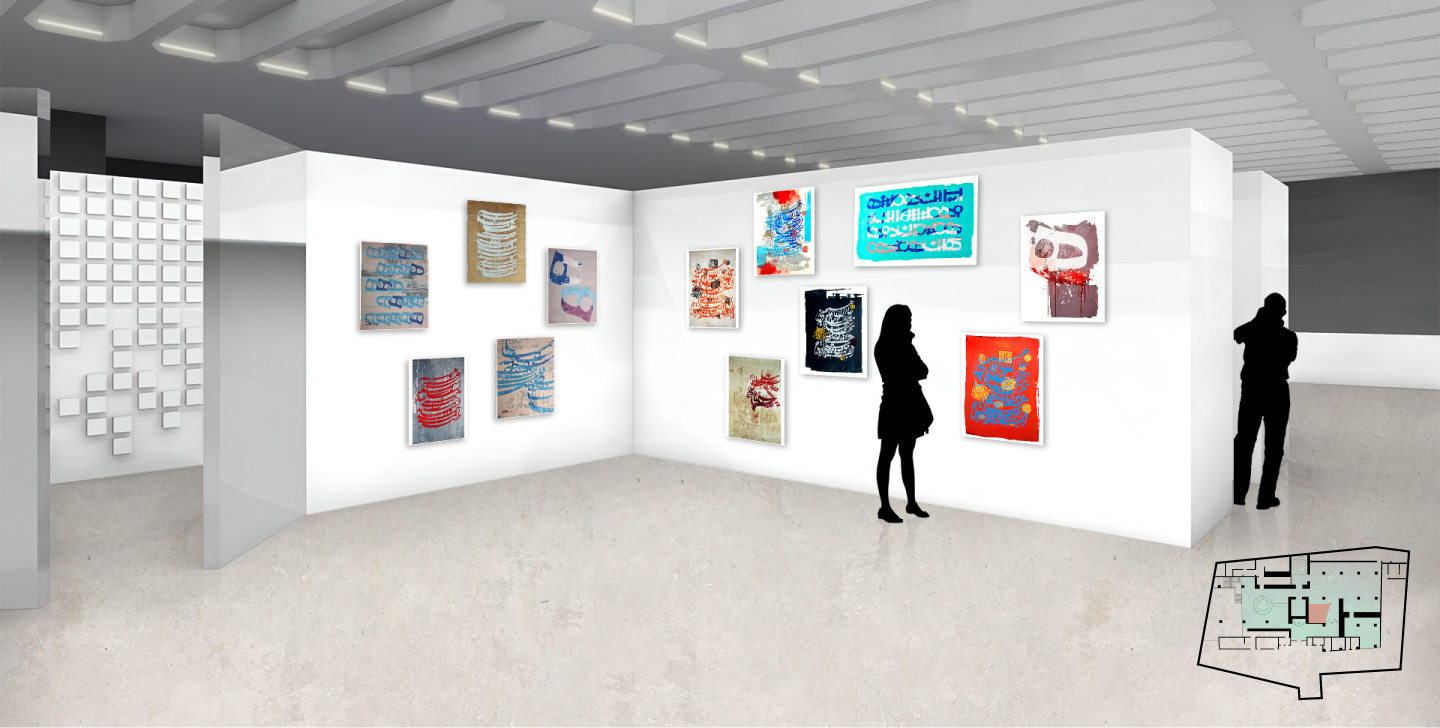
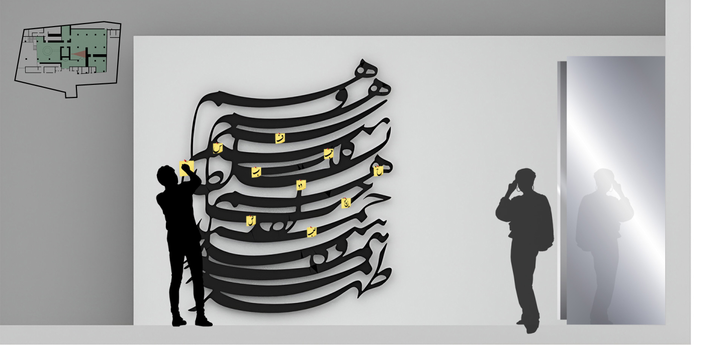
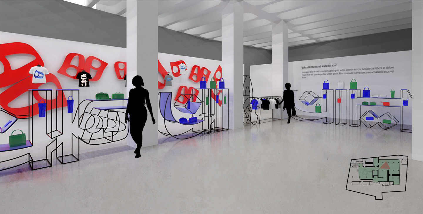
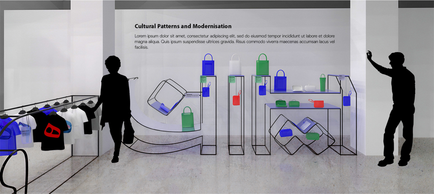
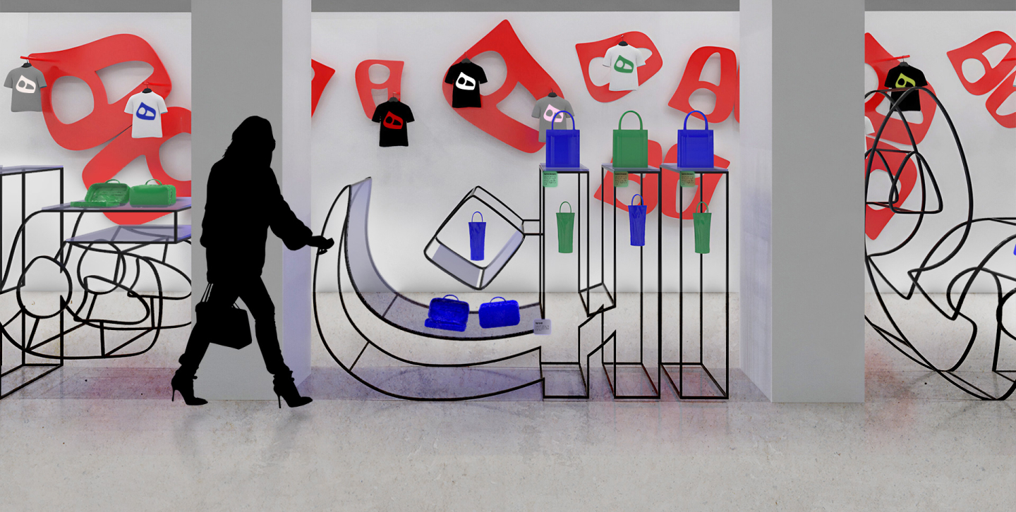
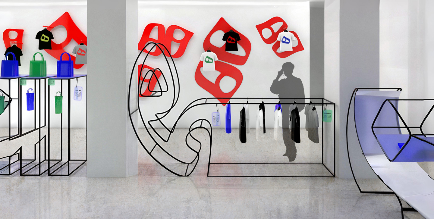
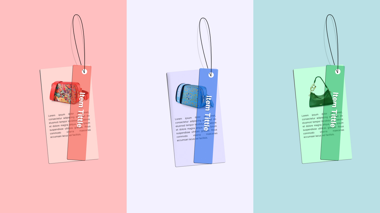
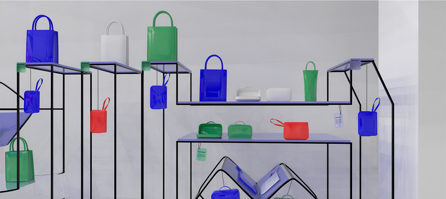
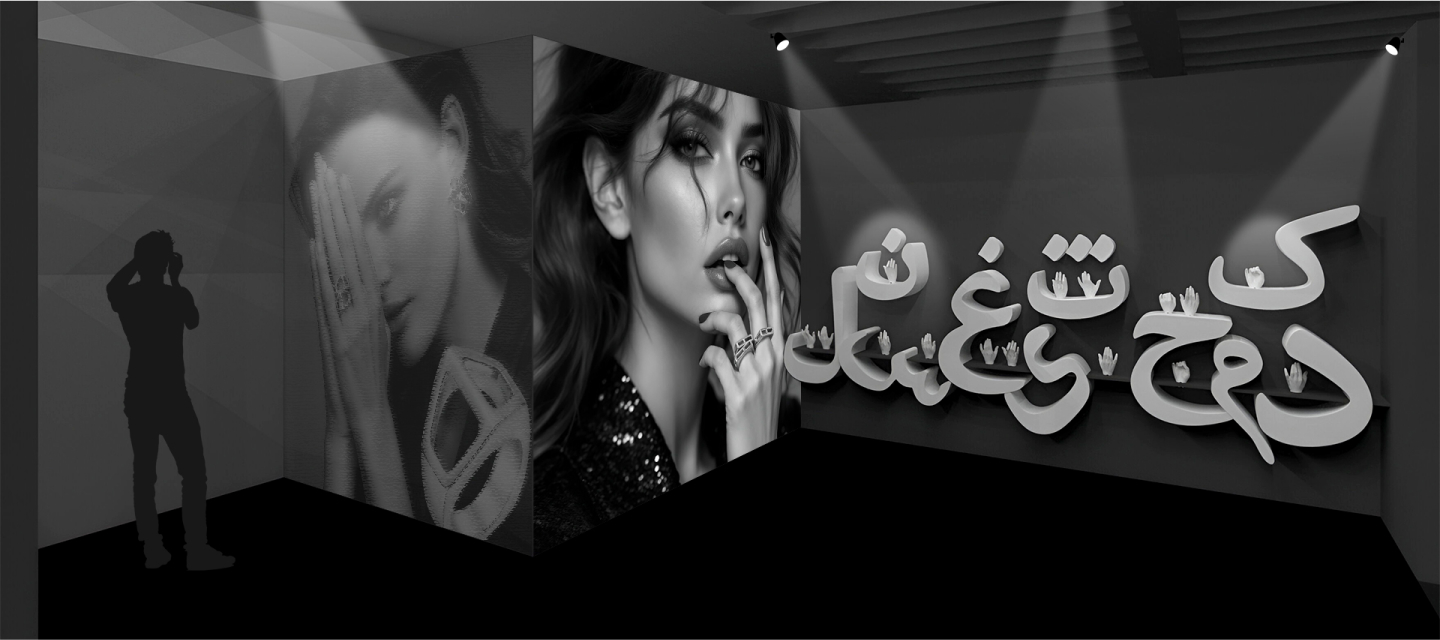
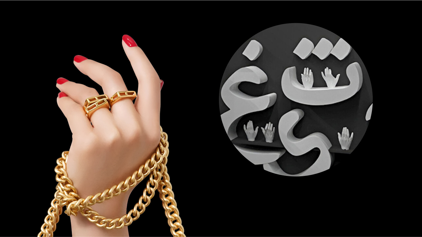
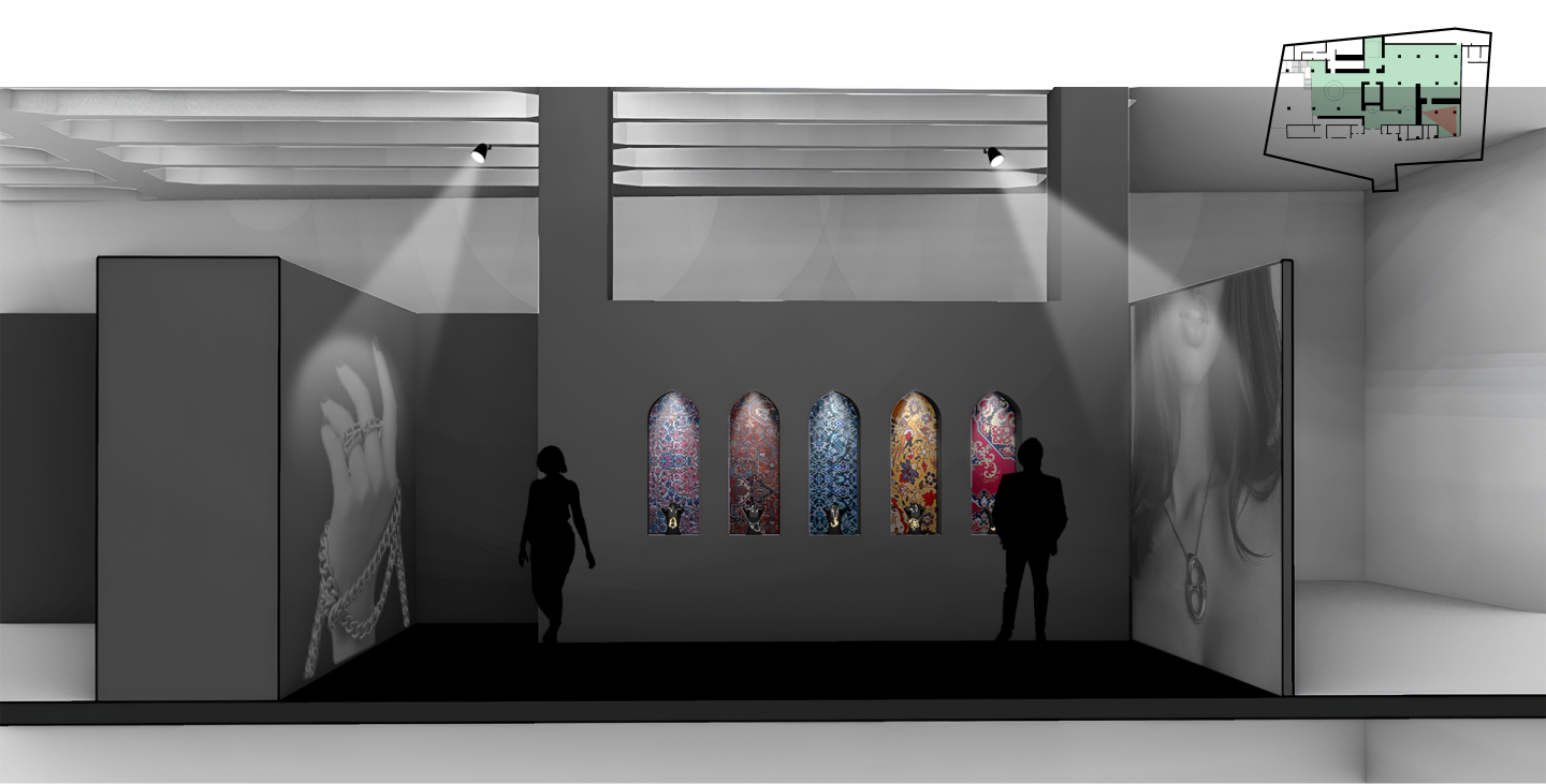
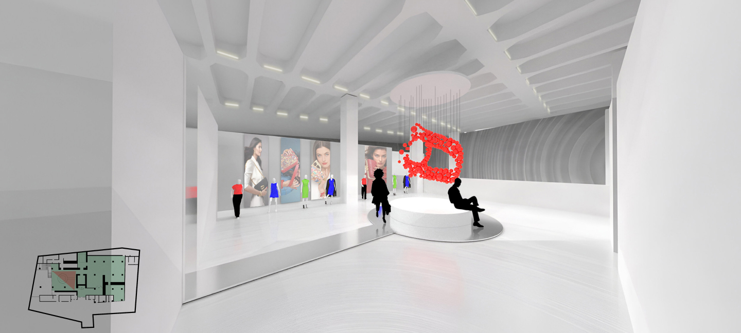
Nimani is an Iranian brand founded by an Iranian designer in New York and has a unique approach to designing its products. The aim of this exhibition is to create an engaging and immersive environment for a fashion show that showcases the brand’s identity while effectively showcasing the products to the audience. This brand has a variety of products, including women’s handbags, jewelry such as rings, bracelets and necklaces, T-shirts and accessories, and decorative paintings.

The location of the exhibition is the famous U tower in Dortmund, which could be a good choice cause of its special location in the city center and convenient access. This building has 7 floors, and the exhibition area is located on the sixth floor.

All products are designed using symbols of Iranian culture, including motifs and patterns, calligraphy, and the Persian alphabet, which, combined with modern fashion, have created special products.
The primary colors used in the exhibition design are derived directly from the products themselves. After analyzing various items, I identified green, blue, and red as the brand’s core colors. These will also be integrated into the exhibition to maintain visual consistency and reinforce brand identity.
The typeface selected for this exhibition is Product Sense. It will be applied in varying sizes, tailored to the content, location, and scale of each text element throughout the space.
The exhibition is divided into three main sections: the central hall near the entrance displays bags, t-shirts, and accessories; the second showcases jewelry; and the third highlights wearable products, reflecting the brand’s craftsmanship and design.
The main entrance leads to a reception and welcome desk, which is framed by the brand’s signature patterned backdrop. From there, visitors enter a corridor that guides them into the main exhibition area. Along this corridor, a wall text introduces the concept and purpose of the exhibition. It outlines the narrative behind the brand and the intention of the show.
On the other side of this corridor, a key feature explores the brand’s most essential design element: Persian calligraphy. The individual shapes of Persian letters are displayed in fragmented forms, each treated as a standalone art object. These are animated on small monitors, which randomly turn on and off, adding a dynamic and interactive dimension.
Upon entering the main exhibition space, one corner features a wall installation displaying decorative panels of calligraphy artworks created by the brand’s designers.
On the opposite wall stands a large-scale metal structure in the shape of stylized Persian calligraphy. Visitors are invited to attach their own calligraphy creations that produced in on-site workshops, to this installation, creating a growing collaborative piece.
For the display of t-shirts, bags, and accessories, a custom metal structure has been designed. Inspired by the elegant curves of Persian script, this structure doubles as both a functional rack and shelving system.
The structure features varied heights and perforated surfaces to enhance flexibility in product presentation. It is envisioned to be constructed using 2×2 cm iron profiles, cut and welded to ensure strength and stability.
Transparent glass components are incorporated into the design to maintain a sense of openness and allow the colorful products to visually stand out.

Overall, the aesthetic of the exhibition is kept minimal and predominantly white, creating a neutral backdrop that enhances the vibrancy and detail of the displayed products. Various angles and elevations of the display structures are presented throughout the space, offering diverse perspectives and engaging visual experiences.

Product information is conveyed through labels designed to resemble clothing tags. These are suspended from the display structures and provide descriptions of each item.
In one corner of the main hall, a table is dedicated to traditional calligraphy tools such as ink, pens, and paper. Visitors are encouraged to experiment with calligraphy in a hands-on setting. A curtain behind this area serves as a projection surface for displaying live calligraphy artwork.
In the jewelry display room, the atmosphere is curated with black walls and flooring. This dark setting, combined with targeted lighting, enhances the brilliance and detail of the jewelry.
A sculptural hand form is used to display rings and bracelets, adding a tactile and artistic element to the presentation.
Opposite this installation, a drywall structure is positioned between two existing columns. Designed with perforations and integrated lighting, it creates illuminated niches where necklaces are displayed against Iranian-inspired patterns.
To the left of the main exhibition is an additional hall featuring an art installation centered on the Persian letter “H”, a symbolic element of the brand’s identity. The letter “H” represents the first letter of the word “Hediyeh” (gift), symbolizing joy and the sharing of meaningful moments. This concept is fused with the aesthetics of a fashion show runway to create a central pathway shaped like the letter “H”, surrounded by brand imagery, posters, and mannequins dressed in the latest collections.

See my other works

Other

Harekat Festival

Exhibition Design